The lockup
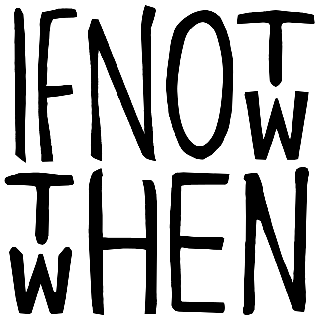
Eleven letterforms. Five words. One question, asked twice before you finish reading it.
Construction
How it reads
The mark is not a wordmark with a clever crop. It is a reading puzzle that resolves the moment you stop trying to solve it. Two columns carry two letters each, stacked. Five of the eleven letterforms are read twice. None of them are drawn twice.
Take the top of both columns and you get if not, then then. Take the bottom of both and you get if now, then when. Read the columns together, top to bottom, and the whole question is already there: if not now, then when.
IF
NOT
NOW
THEN
WHEN
Letterforms
Drawn, not set
Every stroke is brush-drawn and none of them repeat. The two N forms lean differently. The O is an ellipse that never quite closes the way a typeface would close it. Stems thin where the hand sped up and pool where it hesitated.
That irregularity is the argument. A question about acting before you are ready should not look like it was kerned. Do not redraw it, do not smooth it, and never set the phrase in a typeface and call it the mark.
Clear space
Give it a fifth of itself
The clear-space unit is the height of the W inside either shared column — one fifth of the mark. Keep that much empty on all four sides. No type, no rule, no image edge, no other logo inside it. The mark is meant to sit alone, and at least once in any layout it should sit alone and large.
Minimum size
Below this it stops being drawn
The thin points of the brush strokes are the first thing to go. Under 32 px the W in the shared column starts to fill in and the mark reads as a black square with texture. If you need it smaller than this, you need a different asset — ask before you invent one.
32 px
48 px
96 px
Colourways
Five, and no sixth
One flat colour on one flat ground. The mark is high-contrast artwork and it should stay that way — the moment it is tinted down or set on something busy, the brush strokes stop being strokes and start being noise.
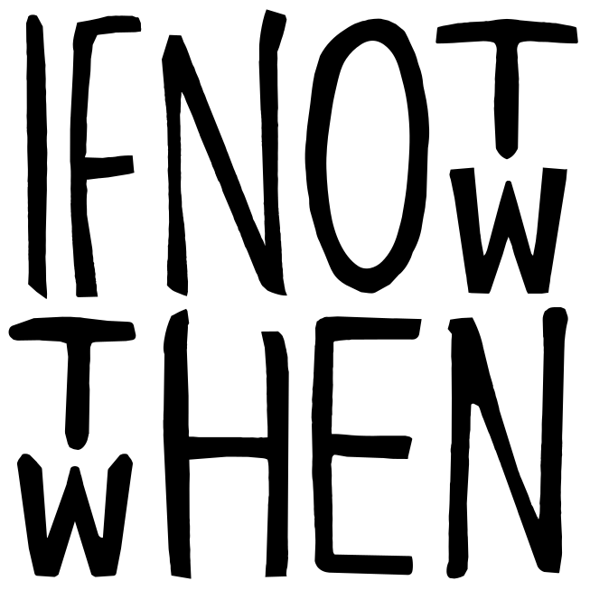
Black on paper
Mark #000000
Ground #FAFAF8
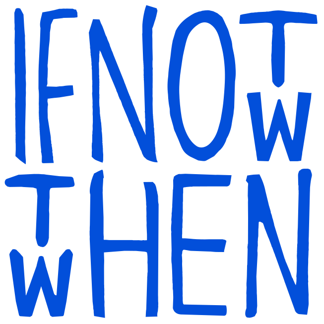
White on cobalt
Mark #FFFFFF
Ground #024FDA · Pantone 293 C
White on black
Mark #FFFFFF
Ground #000000
Cobalt on paper
Mark #024FDA · Pantone 293 C
Ground #FAFAF8
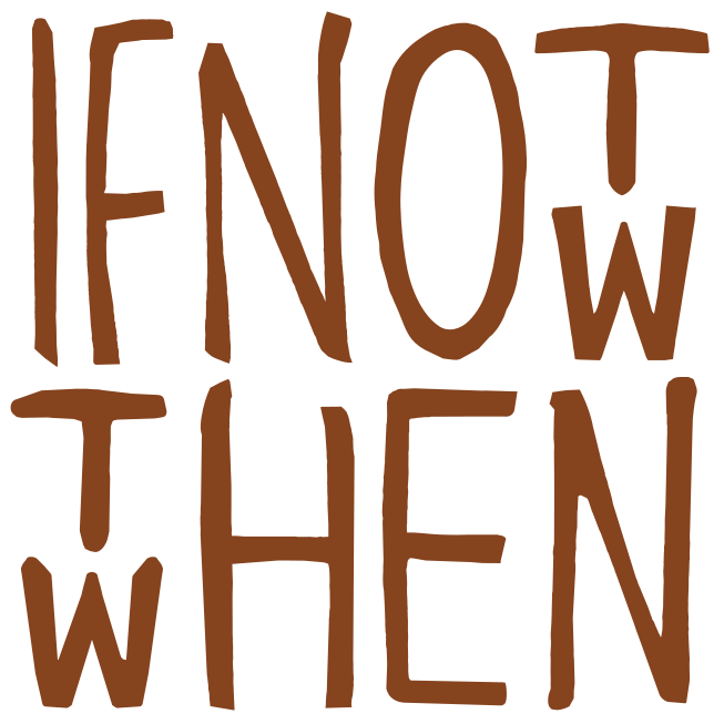
Accent brown on cream
Mark #85431E · Pantone 7517 C
Ground #DAD3C8
Never
- Shine or Green as the mark. Both are sanctioned brand colours; neither is a mark colour.
- Two colours inside one mark, including colouring the shared columns differently to explain the trick.
- Any tint, screen or opacity below 100%. If it needs to recede, make it smaller.
- A gradient, an outline, a shadow, a glow, or a keyline box.
- Directly on photography, unless the area behind it is flat and clears 4.5:1 against the mark.
Usage
One right way
Everything below the first plate is the same mark with a single rule broken. None of it is exaggerated to make a point — this is what those decisions actually look like.
Correct: Alone, at size
Incorrect: Stretched
Incorrect: Rotated
Incorrect: Outlined
Incorrect: On pattern
Incorrect: Tinted back
Incorrect: In a box
Assets
Take the files
Vector in five colourways, plus the transparent PNGs for anywhere that still will not take an SVG. Use the vector wherever the vector will go.